Chart Function
Often you may find that you want to present trends to a user probably by using a chart. Smap provides a function that will retrieve time series data submitted in Surveys that can be presented to the person filling in a survey.
However the data does not have to be time series. The function will return previous values for a specified column separated by colons.
Note
Example Time Series Survey. This survey asks the user to select a school and then the number of girls and the number of boys in attendance. It then uses the pulldata to get data from "chart_self". Chart means the data is returned as a time series, self tells the function to get previously collected data from its own survey.
The chart function is just the pulldata function where the identifier of the containing the data is preceded by "chart_". For example the following pulldata requests will retrieve data in a format that can be used by a chart:
pulldata('chart_self', 'sales', 'region', 'region 1')
pulldata('chart_s1_456', 'sales', 'region', 'region 1')
The first example will retrieve values from the sales column of the same survey that is making the request. The sales values will be retrieved from records where the region is set to 'region 1'. Ie previous submissions. The second example will retrieve sales data matching the specified region in the survey with identifier "s1_456".
Note
The filter column is required as it is a part of the pulldata function. Hence you could not just ask for all the sales data in the survey. This is because pulldata normally expects to just return a value for a single record hence it requires the filter question. When getting chart data however we allow values for multiple records to be returned.
Detailed Example
Here is some collected data that we are going to use in a chart within a survey to show historical sales data.
report_date |
sales |
region |
|---|---|---|
2019-01-01 |
100 |
region 1 |
2019-02-02 |
120 |
region 1 |
2019-04-12 |
150 |
region 1 |
The first pulldata function will get the X axis labels which will be the dates:
pulldata('chart_self', 'report_date', 'region', 'region 1')
2019-01-01:2019-02-02:2019-04-12
The next pulldata function will return the sales data:
pulldata('chart_self', 'sales', 'region', 'region 1')
100:120:150
These labels and data points can then be joined using a double equals in the calculation column of a chart.
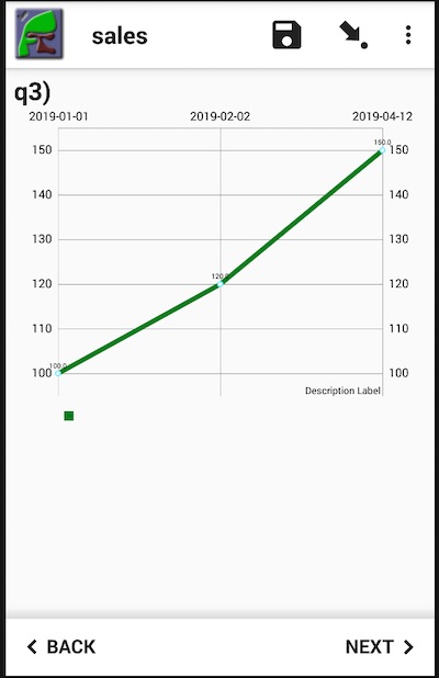
Chart of Sales Data
Warning
A maximum of one pulldata() function should be placed in each calculation. Hence you should not try to put everything into the chart's calculation.